Monday 25 February 2013

Final major project ideas


Through the looking glass

I am thinking of this as my title simply because I am a big fan of fairy tales but I thought that I would take the simplicity of fairy tales and look deeper than just prince meeting princess and the pretty dresses. There is so much more to a fairytale than just the ending such as how did the character get to where they ended up or what challenges faced them along the way, I feel that Alice in wonderland is a good example of this because she couldn't have got to wonderland without the rabbit or the potion she drinks. every fairy tale has these parts to it and I think that this is just an important as the end. the name 'through the looking glass' this has an obvious connection to Alice in wonderland but I also thought that when you do look look through a looking glass you see more clearly than you would without it which is why I think that its the perfect name for this project.


Necessity of perfection

the necessity of perfection was the title of the second project. I started looking at beautiful people such as Audrey hepburn and Marilyn Monroe but felt that I couldn't really take this anywhere. so then the project took a turn into looking at beauty products and the well known catch phrase 'get the London look'. my main focus was around London and what sort of things made it up, the buildings and the people that live there, and the royal family. as we were given the beauty uniforms to work with to create shape with mine, I attached two pair of trousers together to make a very large dress, which I then printed and embellished with topics around London putting beauty words into the skyline images of London. the thing that made this garment great was how large and shapely it was so it could be manipulated into any form which looked great in the photo-shoot, adding a slight bit of humour to the shoot I used Kate moss' face with her being the face of rimmel


Wednesday 9 January 2013

Tube Project

After being set our first project 'tube-works' I found it difficult to find a starting point for this but then realised it was just as simple as the pipes under your sink, which lead me to take my work down the industrial tubes path as well as research other tube forms such as straws and instruments, and as there wasn't to be an outcome for this project I began designing based on these types of tubes. I felt that this helped improve my illustration skills.

we were also set a group task to produce a screen print based on our similar project themes. I found it very difficult to be put in this situation as our groups seemed to have very strong opinionated people who all wanted different designs but we all worked it out in the end and the screen print looked great. Then transforming the print into a garment which is a very tubular shape, before settling on the final garment shape i used a mannequin to see different variations of the material. I took it upon myself to create a photo shoot using a photographer I know, I decided to use a black background for the photos as I thought this was a more appropriate colour for the topic. The photos work really well, I am very pleased with the result


Sunday 11 November 2012

Graphic Design


Understanding Graphic Design

1. There are lots of different disciplines within graphic design. typography is one of these, this is lettering and words, graphic designers tend to make different type so that it has some relevance to that word or the meaning. logos are another discipline of graphic design, the most recognisable logos are things like mcdonalds, nike  and different social networking sites (facebook, twitter, instagram ect... ). graphic designers create things for advertisements like flyers, billboards and the most recent thing is apps for phones. things such street signs and road signs are designed by graphic designers. people don't seem to realise that magazines and book covers is made by designers, nearly everything on each page of a magazine especially on adverts are some type of graphic design. packaging is the final discipline of design which i have been able to identify is packaging of products, things like perfume bottles are a part of this, designers try to make the bottles attractive so they look appealing to customers.
2.
this is the magazine 'computer arts' after looking through the magazine i didn't find any article that i liked, but i thought that the front cover was really good to look at. i think that the colours work well together and the black makes certain things stand out.
3. i was looking on the design museum website and came across a company called 'fuel', there a graphic design company who work in fashion, music and on projects with other artists. they started the company by  producing there own magazine named 'fuel' which is where there business name came from, they then built there projects up from this magazine, the magazine was used to attract people to there company and now they are exhibiting in the design museum. 

Alice In Wonderland - 4LONDONERS - 1 


4. i researched noma bar because his work stood out to me as its very flat bold bright colours and they are very 'in your face' images. He has published over 500 illustrations and featured on over 60 magazine covers. there is not much typography on any of his images so he uses the picture the get the message across which i think is an interesting way to do it as it makes you go away and think about the images which you have just seen.


5. I feel that this week has helped me to look into design more and to notice the things around me that are designed by graphic designers, everyday things such as logos on clothes which i would have not noticed before. i really enjoyed developing our own type around the words we were given, i found that helped me to look at the words and recognise the meaning behind it. i think that i would have liked to have designed a logo based around the word as well as just the typography as this would have given me some knowledge of this area.


illustrators


Quentin blake:
Urn tin Blake appeals to me as the Ronald Dahl books were some of my favourite as a child and I think that he really made the characters come to login his illustrations which helped my imagine the characters as I was reading.


Luke best:
The main thing that attracted me to lukes work was the way that he uses block colours. Such as the way that the colour of the background contrasts to the colours of the objects/ character which makes them stand out.


Lydia Wong:
Lydia Wongs work is very different to some of the other illustrators I have seen as her pictures almost look like they could be photographs.

Claudio Brave -Fine Art


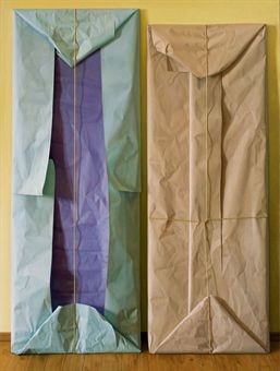
Claudio bravo was a hyper-realist painter, he was influenced by the surrealist artist Salvador dali. I find his work very intriguing, I am not really interested in his still life paintings and his portraits of people, but i find the packages and fabric interesting. I find that showing folders in paper or fabrics is a hard thing to achieve but he does it perfectly in his work and they look so realistic, although his portraits and still lives are just as realistic. i think that Claudio is a very talented painter and I would be interested to look at more of his work.


Friday 26 October 2012

Fine Art


these images are from the fine art week. i found this week very fun and felt very free to do what i want with my work. the first two images i felt like i had to be neat and then on the second two pictures i was more free using cardboard to create the patterns with colour.